For this week’s Usability & Productivity report, we’ve got oodles of goodies, including some new features, a whole bunch of visual improvements related thumbnail previews in Dolphin, the open/save panels, and desktop icons (i.e. Folder View), icon improvements throughout KDE apps when using a High DPI screen, and lots of other miscellaneous goodies! We haven’t forgotten about Samba, and another very important fix landed. There are more in the works, too. Have a look:
New Features
- Info Center now has a “Copy to Clipboard” button that copies everything to the clipboard (Gregor Mi, KDE Plasma 5.14.0):

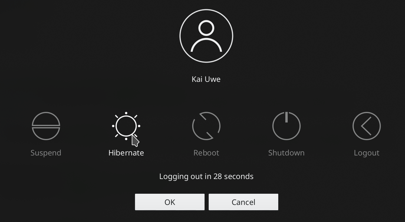
- The Logout Options screen now shows “Hibernate” as an option if hibernation is supported (Kai Uwe Broulik, KDE Plasma 5.14.0):
Bugfixes
- Fixed a data loss issue that could affect non-KDE apps that perform atomic saves when saving modified files located on Samba shares (Jaime Torres Amate, KDE Frameworks 5.51)
- Fixed a security issue that could allow maliciously-crafted .okular archive files to create arbitrary files on the user’s computer (Albert Astals Cid, KDE Applications 18.08.1)
- The Kicker Application Menu now responds properly to arrow key navigation after searching (Eike Hein, KDE Plasma 5.12.7)
- The Plasma calendar now properly supports locales where Sunday isn’t the first day of the week (Kai Uwe Broulik, KDE Plasma 5.14.0)
- The Media Player plasmoid now shows correct playback length and status for media that is longer that 33 minutes and 22 seconds (Arsen Arsen, KDE Plasma 5.12.7)
- Significantly improved performance when using a Folder View plasmoid that’s sorted by date (Kai Uwe Broulik, KDE Plasma 5.14.0)
- KRunner can now find bookmarks created with recent versions of Firefox (Stefan Brüns, KDE Plasma 5.14.0)
- Monochrome icons are no longer invisible when selected in Dolphin (Kai Uwe Broulik, KDE Applications 18.08.2)
- Dolphin now correctly saves your preferences when you change Settings -> General -> Confirmations -> Executing scripts or desktop files (David Edmundson, KDE Applications 18.08.1)
- Reduced the number of times that Dolphin needs to look up file information, which should improve response times with Samba shares and other slow network locations (Kai Uwe Broulik, KDE Applications 18.12.0)
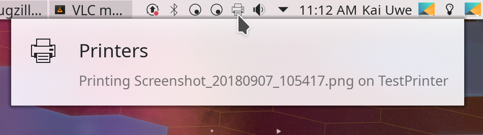
- Gwenview now names print jobs appropriately (Kai Uwe Broulik, KDE Applications 18.08.2):
- Fixed the “Solarized” color schemes in Kate to be readable (Andrew Crouthamel, KDE Frameworks 5.51)
UI Polish & Improvement
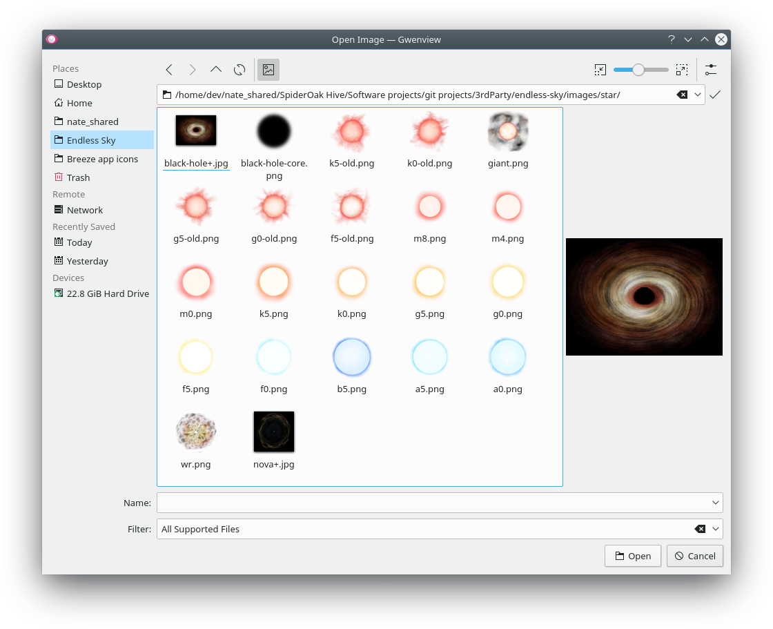
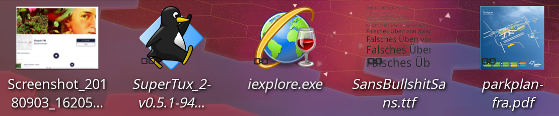
- Improved the behavior of drawing frames and shadows for thumbnail previews in Dolphin and the file open/save dialog: now frames and shadows are drawn only for images with no transparency, improving consistency and visual presentation, particularly for icon files and PNGs with transparency (me: Nate Graham, KDE Applications 18.12.0 and KDE Frameworks 5.51):


- Desktop icons now show thumbnail previews just like Dolphin, and those previews can be turned off if desired (Kai Uwe Broulik, KDE Plasma 5.14.0):
- The Samba credentials System Settings page is now located in a more appropriate location, under the “Network Settings” category (Kai Uwe Broulik, KDE Plasma 5.14.0)
- All of Spectacle’s save options are now located on the “Save” page (Kyle Utecht, KDE Applications 18.12.0)
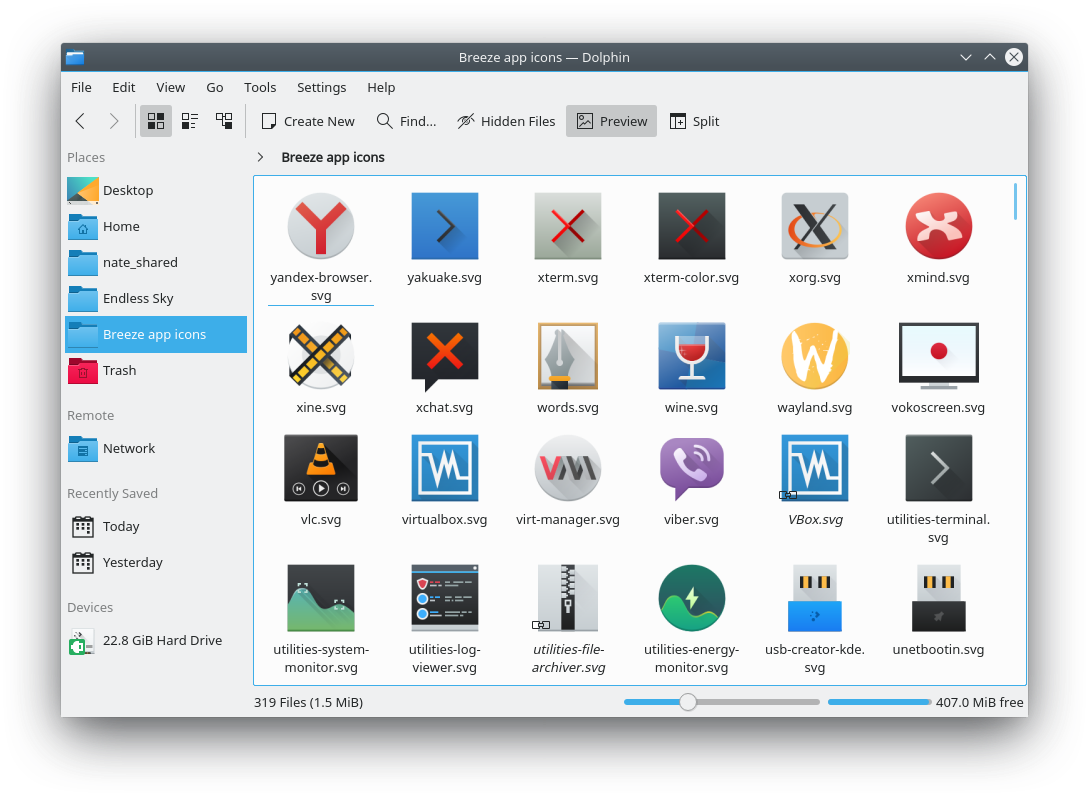
- Improved the clarity of small icons when using Dolphin on a High DPI screen (Kai Uwe Broulik, KDE Applications 18.08.2):
- When using Dolphin on a High DPI screen, the places panel still shows monochrome line-art icons, and they’re nice and sharp. This also improves icons throughout all other KDE apps too! (Chris Rizzitello, KDE Frameworks 5.51):

Impressive stuff, huh? Just look at KDE’s momentum these days: improvements throughout the stack every week. We’re on a mission to make KDE Plasma and apps the pre-eminent desktop computing environment, and we’d like you help! Be a part of something big. Next week, your name could be in this list! Just check out https://community.kde.org/Get_Involved, and find out how you can help be a part of something that really matters.
If my efforts to perform, guide, and document this work seem useful and you’d like to see more of them, then consider becoming a patron on Patreon, LiberaPay, or PayPal. Also consider making a donation to the KDE e.V. foundation.

As always, thank you very much Nate and the whole KDE team! It’s great to see that KDE evolves continuously. Looking forward to getting involved as well in the future. 🙂
LikeLike
You’re welcome! It’s all pretty cool, huh? Let me know if you need a hand getting started!
LikeLike
When will the blur effect on the login screen be made optional?
Forcing this upon users without an opt out is very Gnome-like, KDE normally does not do this.
Everything else is going swimmingly.
LikeLike
Please feel free to read and follow https://phabricator.kde.org/T9658.
LikeLike
Thanks.
The login / lock screen blur effect should be able to be disabled via a setting, in a similar way to the blur desktop effect can be enabled or disabled.
LikeLike
It’s not that simple. The blur is done for readability reasons. While we could provide a setting to turn it off, this would inevitably mean that some people would turn it off and then complain that the white icons and text become unreadable with whatever background they use (especially if they use a slideshow background where the images are semi-unpredictable). That’s why we’re trying to come up with a design for the text and buttons that doesn’t require blur to be readable in the first place. Once we do this, then the blur will become optional eye candy, not a necessity for the design’s usability.
LikeLike
There is a lack of consistency when it comes to labeling power options. Some places like KRunner/AppDash use Suspend to Disk/RAM whereas other places use Hibernate. Over the years I have seen KDE seem to swing between the two naming schemes I am not sure why.
LikeLike
Good point. I’ve submitted a patch to fix that: https://phabricator.kde.org/D15386
LikeLike
Thank you.
LikeLike
The patch was accepted, and the change will appear in Plasma 5.14.
LikeLike
Good job ! Thanks for the continuous improvements.
I use Plasma 5 on my PC with openSUSE and I am very satisfied!
LikeLike
On behalf of all KDE contributors, you’re very welcome!
LikeLike
All kinds of great new features. Happy to see High DPI support coming along!
LikeLike
Yes, it really is!
LikeLike
Excellent job.
LikeLike
Thank you!
LikeLike
What about this issue on chromium which doesn’t happens on Fedora? https://i.imgur.com/ft49361.png and what about the fact that chromium uses OPENGL 3.0 instead of the latest one via MESA drivers despite of the gpu’s owner drivers!? thanks.
LikeLike
Those sound like Chromium issues, no?
LikeLike
No, because it doesn’t happen on Fedora The color information on Fedora is correctly issued. Could be an error caused from the monitor driver? If you have the possibility, control the monitor driver on the system manager both on Fedora Plasma desktop and KDe Neon or Kubutnu. They appear named in different way. The question about mesa drivers which are limited to opengl 3.0?
LikeLike
No idea, sorry. This isn’t really my area of expertise.
LikeLike
Someone posted your discussion on a forum:
https://phabricator.kde.org/T9658
The thing that worries us, you are completely missing the point!
After some time living with that login screen, I started to dislike the blur in it. Not the effect – that is completely fine and awesome. The blur itself on the login screen is just useless and disturbing.
The thing is: blurring effect is great when you use it on mostly on a desktop, so when you want to shut down a system or log off. It’s because you see the sharp, beautiful desktop all the time and when you want to do the action, full screen blurred GUI looks awesome and is just a moment. Deepin DE is doing it perfectly.
On SDDM, the first thing you want to do is to log in and then SDDM screen is gone. This causes the whole background to be not visible at all. It’s like: we have this beautiful login wallpaper but we cannot see it at all, because it gets blurred right away and then it’s gone.
I absolutely can’t understand what was the issue with the old login screen. Everything is always perfectly visible and sharp on the wallpapers I chose and people have mostly the same experience. Unlike desktop wallpapers, login wallpaper is changed rarely so once a beautiful background is found, we want to enjoy it for a longer time. We won’t be bored so easily because we see it only for a short time, unlike the desktop. With the blur effect, it’s like we were stripped of that beautiful login experience, hence the negative feedback.
And all that it took to fix it is to give us a simple on/off switch for the blur effect – it’s all we ask for. Those who, from unthinkable reason, want to put a wallpaper that disturbs SDDM UI, can use the blur but the rest of us should get the unblurred version.
Also, the issue is that Plasma users are tinkerers and we like to have many options because this gives us choice and freedom. Introducing mandatory SDDM blur was like taking away a pice of that freedom and that stings.
So again, I love the blur but not on SDDM, at least not without choice as it is now. I and many others feel strongly about it. It’s been some months since the feature showed up and I didn’t get used to it, I started to dislike it even more.
LikeLike
By the way: blur on a lock screen is fine, although it would be nice to have also on/off switch, because not everyone will enjoy it.
Again, blur on a desktop is not the same as the blur on login or lock screen, especially on login screen.
LikeLike
I don’t think I’ve missed the point. The point is that people don’t like the blur on the login screen because it obscures the background, which for many people (myself included) was deliberately chosen to look pretty. I get it.
The issue with the old login screen theme was that the white buttons and text could become unreadable with various backgrounds, such as a snowy landscape or a very visually busy image of any sort, really. I understand that *you* didn’t choose such an image, but many users (or distros!) did, and some of the default Plasma backgrounds were offenders too. We got bug reports. A lot of them. It was a problem we needed to solve, and the blur solved that problem.
I understand that it introduced a different problem: now the pretty background you chose is blurred and darkened. Darn. I get it. It annoys me too. That’s precisely why I’m trying to move the discussion towards a way for us to remove the blur on the login screen. But to do that, we have to come up with an alternative method to make sure that the buttons and text are visible no matter what color or background you choose.
It’s not as easy as “Just add an option!” First of all, that’s the designer’s lazy way out; we should fix the design so the option isn’t necessary. Second of all, the Breeze SDDM theme currently has no options, so we would need to add a lot of code just to gain that ability. It would actually be easier to just fix the design! That’s what we’re trying to do.
LikeLiked by 1 person
I understand your points but a visibility issue with some users’ “snowy” background images should not be solved by obfuscating the background images for all users. IMHO that is poor and lazy design.
A more elegant option could be to provide some sort of text color button toggle on the login screen itself rather than obfuscating the image entirely. The issue seems to be all about text color readability, rather than image color. You will never find a color that will be visible behind all possible images.
KDE is all about choice, flexibility and options. The plethora of options is what makes Plasma what it is. Providing configurability on image blur or text color (or any other possible light image workaround) is not lazy, it is the KDE way.
Forcing a blur solution without choice is unfortunately not the KDE way, but at least now we can understand that this was implemented with the right intent. We are also thankful that this sort of issue is able to be discussed within the community.
LikeLiked by 1 person
Thank you for the explanation.
As the comment below pointed out, Plasma users are most happy if we have options. The design is important but with so many options we can never have the perfect solution and I don’t think that it’s a developers task to find one, at least not on Plasma. Just gives us options and tools and we design it the way we want.
For Gnome where there are not so many options, you can focus more on design. Without the hassle of plethora options Gnome devs still can do a bad job in some areas, like GDM requiring some keystroke before being able to input password. That’s craziness! I can’t figure out how Gnome devs are not seeing this. For you guys, it’s obvious so SDDM is better designed from the start.
On Plasma, there is always some setting that will clash with the design. For example, all transparency options will cause various issues with wallpaper of font colors. Plasma allows it and now it’s up to the user to choose settings that work. I would be mad if you – a developer, took a choice from me for the sake of excluding all potential problems. That’s a Gnome way, or at least how they perceive it. IMO they cause more issues than solve problems but that’s just my opinion and it’s irrelevant here.
So simply put, some things exclude mutually. Plasma/KDE is more about choice and freedom. Sure, some will hate it because of it, some will point poor design choices (because they set something that doesn’t look right) but you can’t please everyone. Plasma users exactly love it for what others despise.
You talk about design but users wish exactly that: “add an option”. No matter what you do with design, Plasma users won’t be happy either way. Give us a choice – Plasma users will be happy :D.
However, I’m sad to hear that this seemingly simple solution isn’t really so simple to implement. So I think that design way may be only a temporary workaround toward the real solution – “having an option” way.
We can already set images to SDDM and that’s awesome. Having few additional tweaks would be even more awesome. Granted, this isn’t an essential thing so we don’t have to have it right now, but it would be great to have it. Probably users won’t appreciate those, because we don’t understand how much works it required, as everything in Plasma, but we still enjoy it. Just see Gnome DM, it’s ugly and non-configurable. That alone can be a reason not to use Gnome ;). There are users who design mockups for it trying to create interest so Gnome developers would add something decent, the current state is a disaster. Plasma is in much better place, but I hope that Gnome won’t be the first having DM tweak options ;). DId you see those GDM proposals? They are stunning so maybe someday Gnome will have it.
Back to the design, having a white font with black edges would help visibility. Would it look good? Probably not… but that has to be tested. I’m not a fan of color stripes as background for GUI, it would look rather bad, although… I’m not a designer so I may be wrong.
SDDM themes like Maldives or Elraun won’t have this invisible UI problem but man, how ugly they look. If you did that, people would hate it and won’t let you in peace ;). Now as an option is fine, but having such design for Breeze, Breath or Andromeda (who mostly do the same) would be awful.
Latte does its dynamic font color on a background and sometimes it helps, often it does not, so such solutions aren’t perfect either.
Android also has dynamic colors and transparency for its panels and it works quite well but… there are wallpapers that make panel fonts invisible.
So transparency comes with a load of design issues, but once you try it, it’s hard to go back to plain, non-transparent look. The whole SDDM UI design is based on UI is on a transparent layer before background so all the transparency problems happen here.
Maybe there is a design that will somehow cope with that when still looking modern and nice but KDE is all about choice. The previous state was better because only some had issues with it and they were still free to change the background. Now nobody has any choice whatsoever and that is so upsetting about it. The fix became the bigger issue the previous problem IMO.
Luckily, I’m confident this will be somehow resolved eventually. Maybe not right now but someday, because I know that Plasma/KDE devs are not stupidly stubborn with design decisions as Gnome ones (yeap, as you noticed I have a problem with Gnome, I liked it in the past but it was being destroyed with every version so now I’m at war with it ;P so ignore this). If something is not working, you guys are trying to change it for the better. And that is what is why I’m calm about it. I’m not happy with this SDDM blur but I’m not angered because I know it’s just a work in the process and you care to make it better every day.
The whole blog of yours is a phenomenon and an incredible thing. Developers rarely want to have that kind of exposure and close relationship with the community.
LikeLike
Thanks for noticing. 🙂
This issue will indeed be fixed, not to worry. Just to set expectations, it probably won’t be in Plasma 5.14 I’m afraid, since the feature freeze is in two days. But likely for 5.15!
LikeLiked by 1 person
Ha, someone on Manjaro forum just posted a manual fix for the blurred SDDM:
/usr/share/sddm/themes/breeze/Main.qml
Line 104 (under WallpaperFader)
visible: config.type == “image”
change to
visible: false
Or change for any other SDDM theme you use. I haven’t tested it yet myself but I will.
I don’t understand coding but if there is such an option in theme, why is it hard to make GUI setting that would change this qml file for each theme? We could have this under SDDM’s theme wallpaper selection. It’s a big, empty space anyway… ;).
LikeLike
Take a look here: https://forum.manjaro.org/t/plasma-is-great/31081/1264
It isn’t that hard to put a toggle in the kcm module. Please do it and keep up the good work. I’m loving this usability project.
LikeLike
If it isn’t that hard, would you like to submit a patch? 🙂 I’m currently nose-deep in https://phabricator.kde.org/D15318 and won’t have time to get to that in the next day or two.
I’m glad you’re enjoying the progress.
LikeLike
New review
new spanish translation
https://victorhckinthefreeworld.com/2018/09/11/mejorando-kde-en-facilidad-de-uso-y-productividad-parte-35/
Happy hacking!
LikeLike
Can confirm the Manjaro solution works! No more blur.
SDDM Breeze Login Screen:
Edit /usr/share/sddm/themes/breeze/Main.qml
Find WallpaperFader and make visible: false
Breeze Lock Screren:
Edit /usr/share/plasma/look-and-feel/org.kde.breeze.desktop/contents/lockscreen/LockScreenUi.qml
Find WallpaperFader and make visible: false
Wow. Two one line edits and blur is gone. Thank you Manjaro.
LikeLike
Great job as always! Thank you for your hard work. KDE Plasma is looking better every day.
Could you please take a look at this bug: https://bugs.kde.org/show_bug.cgi?id=382374 (Second Screen Desktop config lost after turning off and on both DP-Displays)? It was reported more than a year ago and is still present even in last KDE Neon. It’s a real problem for all of us who use multiple displays.
LikeLike
There’s a chance this bug will be fixed with Plasma 5.14.0, which received some multi-monitor fixes. Can you test once the 5.14. bets is released in a few days?
LikeLike
Sure, I’ll be testing Plasma 5.12 when it’s out 🙂
LikeLike
Hi, I have a problem with Discover and I tried with 2 different installations with the same result. Everytime I search the word “scan” it freezes, the cpu increase its percentage of use and Discover increase its memory usage reaching about 1 GB of use.
Is a problem with my installation or is something wrong with Discover? I’m using KDE Neon 5.13.5 and all is up to date, thanks!
LikeLike
Sounds like https://bugs.kde.org/show_bug.cgi?id=394983. Could you leave a comment in there saying that it happens to you, and even better, could you capture a stack trace with GDB? See https://community.kde.org/Guidelines_and_HOWTOs/Debugging/Debugging_with_GDB
LikeLike